Spring's Hot Honey
Categories
Freelance
·
Branding
Year
2025
Duration
3 Months
Client
SHH Founder
Overview
Born from a father's love for making the perfect pizza, Spring's Hot Honey was created to enhance this beloved dish.
A story behind the product and a marketplace to sell it were necessary, so branding and creating its website became my role in this project.
Logo & Branding
The logo was designed with a simple approach to remind people of a seasoning brand. It combines two font styles and emphasizes "Hot Honey" so people immediately understand the kind of products they offer.
Here, I’ve curated the brand colors with purpose, outlining their meanings and how they should be used to maintain a cohesive and impactful identity
Meet the Users
Based on research into target customers, these personas were crafted to guide product and marketing strategies. By defining goals, motivations, and challenges, Sarah and Greg represent key segments interested in Spring’s Hot Honey and its unique culinary appeal.
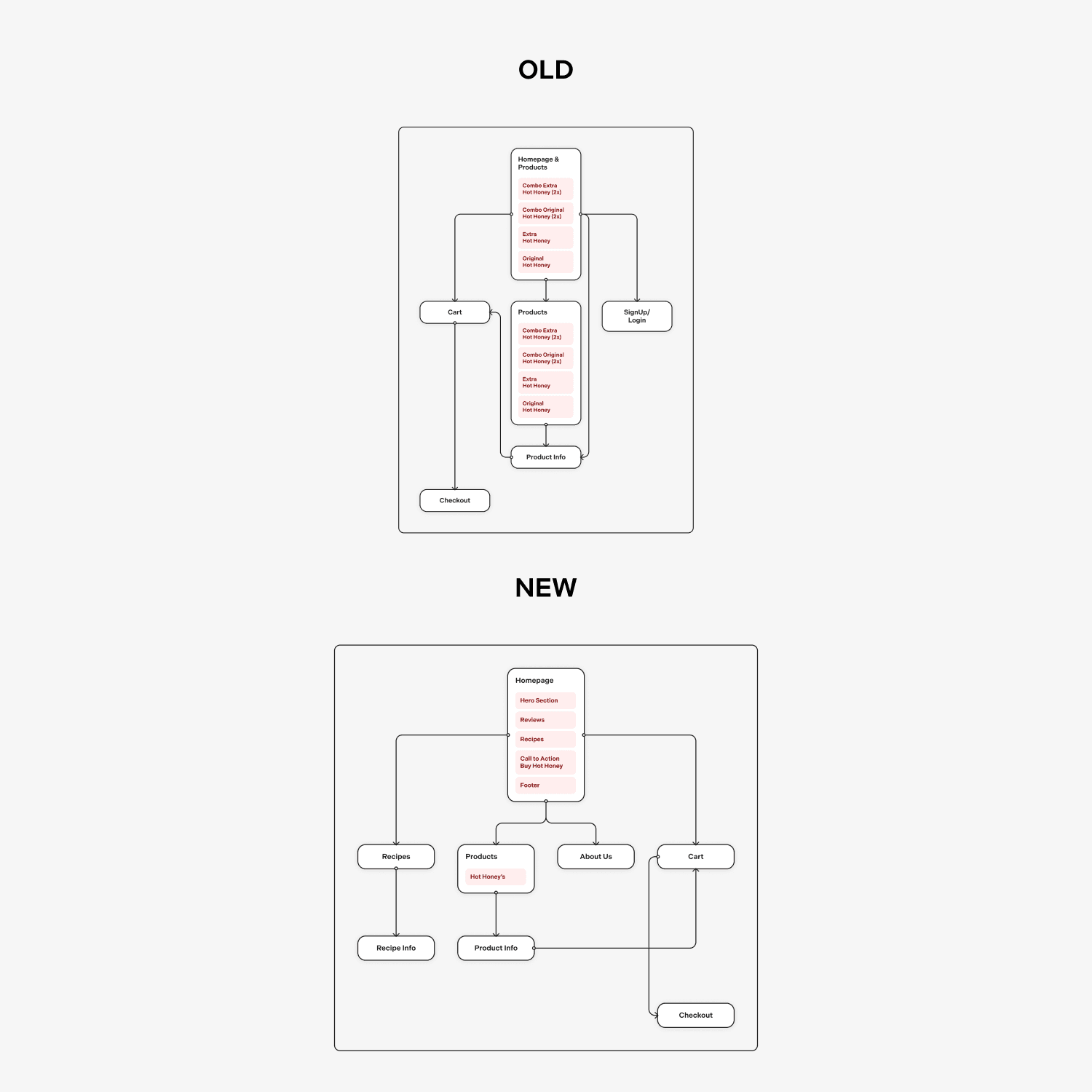
Site Maping & Wireframes
This sitemap redesign adds a focus on user engagement and streamlined navigation.
The new structure includes a "Recipes" section and customer reviews to enhance product appeal, while a clear call-to-action on the homepage encourages purchases.
Improved layout and category organization simplify the user journey from exploration to checkout.
Final Visuals
This design balances warmth and intensity, capturing the blend of sweetness and spice.
Bold color contrasts and oversized typography create visual impact, while streamlined elements guide the eye intuitively.
The layout’s simplicity foregrounds the product’s essence, using minimalistic cues to evoke flavor and encourage interaction.
Project Takeaways
I'm thankful to have worked on such a cool project where I was able to learn and improve many skills. I created a complete web experience from sketching to prototyping and finally implementing it on a framework, while also helping to shape the brand's image.


